Created in collaboration with Audrey Crane, Jim Faris, and Harry Saddler.
This diagram explains Java by placing it in the context of related concepts and examples, and by defining its major components and other connections between them.
The diagram is intended to help developers who are familiar with one part of Java understand other parts. It relates unfamiliar technologies to ones with which developers may already be familiar. The diagram also provides an overview for developers who are new to Java and an introduction for non-programmers who want to improve their ability to converse with developers.
The completed map contains approximately 235 terms, 425 relationships, and 100 descriptions.
For many years, Stanford University Cardiac Rehabilitation Program (SCRP) has conducted research on ways to change the behavior of patients who have had heart attacks. Their research is aimed at reducing the risk of a patient having another heart attack. Educating patients and their families is a key component of changing patient behavior.
Working under contract with the American Heart Association, the Stanford team asked DDO to help them develop a master plan for a new education program. DDO developed a series of prototypes of an integrated communications program involving print, video, and online components. One print component, a Health Coach notebook for patients (images below), included educational material, including this concept map. In this map, a patient can quickly see what a heart attack is, its causes and risk factors, and most importantly, behavior that can reduce the risk of a heart attack.
The domain name system stores and associates many types of information with domain names, but more importantly, associates domain names (computer hostnames) to IP addresses. DNS is a system vital to the smooth operation of the Internet.
The goal of this diagram is to explain what DNS is, how it works, and how it’s governed. The diagram knits together many facts about DNS in hopes of presenting a comprehensive picture of the system and the context in which it operates.
Hugh Dubberly created this diagram in conjunction with a study: “Internet Navigation and Domain Name System.” The study was run by The National Academies’ Computer Science and Telecommunications Board which convened a study committee. The study was sponsored by the Department of Commerce and the National Science Foundation and mandated by the US Congress.
Increasingly, organizations are focusing on understanding their customers to increase customer satisfaction and to maximize lifetime customer value. Insights gleaned from observing customers can drive product improvement, loyalty, word-of-mouth referrals and cross- and upselling.
Created for CIO Insight magazine, this diagram decodes current methods of customer tracking, retention, and acquisition. It shows the relationship between customer data, touch points, behaviors, data capture systems, customer databases, data integrity, customer segmentation, lists and targeted offers. The goal of the diagram is to provide a model of how organizations today track customers to retain them longer and acquire more.
Created in collaboration with Sean Durham, Ryan Reposar, Paul Pangaro, and Nathan Felde.
This model is built on the idea that innovation is about changing paradigms. The model situates innovation between two conventions. Innovations transform old into new. It is a process—a process in which insight inspires change and creates value.
Created in collaboration with Satoko Kakihara, Jack Chung, and Paul Pangaro.
This model is built on the idea that play is a type of conversation. It involves two individuals, who might also be teams, or points of view with in a single person, or a virtual person and a real person. Through conversation, they create a shared world in their imaginations, which leads to fun.
Created in collaboration with Jack Chung, Shelley Evenson, and Paul Pangaro.
The creative process is not just iterative; it’s also recursive. It plays out “in the large” and “in the small”—in defining the broadest goals and concepts and refining the smallest details. It branches like a tree, and each choice has ramifications, which may not be known in advance. Recursion also suggests a procedure that “calls” or includes itself. Many engineers define the design process as a recursive function:
discover > define > design > develop > deploy
The creative process involves many conversations—about goals and actions to achieve them—conversations with co-creators and colleagues, conversations with oneself. The participants and their language, experience, and values affect the conversations.
A concept map is a picture of our understanding of something. It is a diagram illustrating how sets of concepts are related. Concept maps are made up of webs of terms (nodes) related by verbs (links) to other terms (nodes). The purpose of a concept map is to represent (on a single visual plane) a person’s mental model of a concept.
Concept maps provide a useful contrast with essays. With a concept map, a viewer can see both the forest and individual trees. The big picture is clear because all the ideas are presented on one surface. At the same time, it’s easy to see details and how they relate.
Examples and a good description such as those described by Gowan and Novak (in Learning How to Learn) are helpful for understanding concept mapping. An exercise in which you make a simple concept map (with eight to 12 terms) may also be helpful.
The first step in concept mapping is to generate lists of words related to the main concept. The list can come from research, reading, experts, brainstorming, or any other source. Sharing lists from members of a development team will help generate other words.
The second step is to edit the list. Some terms may be related to the subject, but not in a way that meets the project goals.
The third step is to define the terms on the edited list. This is particularly important with unfamiliar or technical terms. But it also helps with familiar terms, too.
A useful exercise is to create a matrix listing all the terms down one side and repeating the list across the top. The relationship between the terms is noted in the boxes where a row and column intersect. The resulting matrix of relationships provides a checklist for building the concept map.
Another important step is ranking of the terms. Simple “triage” may be sufficient. Some terms are key to defining the concept. Others are clearly details. Some fall in the middle. The ranking provides a way to begin to look at building a structure. Primary terms may be candidates for an armature sentence.
One approach is to ground the primary concept within a sentence that also contains the other two or three most important terms. A first sentence might set context; a second sentence might define the main term branching out at 90 degrees from the first sentence. The armature sentence provides a starting point for the map. From there, you can add secondary terms and then the details.
Another approach, is to look for a structure or model to underlie the concept map. For example, brand is a type of sign. Signs have three components. Those three components become the anchor points of the concept map. Innovation is a process which repeats, oscillating between convention and innovation. The process provides a structure for the concept map.
Making a concept map in an area that is well defined is sometimes fairly easy — if the information space can easily be found and if most authorities agree on it. For more ambiguous topics, a great deal of time may be needed to agree on scope (which terms are in or out) and on structure (how those terms relate). This process can take several weeks or even several months.
Once the terms and structure are agreed to, you can move to a second phase: giving the map an appropriate typographic form — to make the typographic hierarchy support the structure of the content.
Main steps in creating concept maps:
List terms
Edit the list
Define the remaining terms
Create a matrix showing the relations of terms
Rank the terms
Decide on main branches or write framing sentences
Designed by Thomas Gaskin.
Creative direction by Hugh Dubberly.
Algorithms by Patrick Kessler.
Patent belongs to William Drenttel + Jessica Helfand.
This poster illustrates a change in design practice. Computation-based design—that is, the use of algorithms to compute options—is becoming more practical and more common. Design tools are becoming more computation-based; designers are working more closely with programmers; and designers are taking up programming.
Above, you see the 892 unique ways to partition a 3 × 4 grid into unit rectangles. For many years, designers have used grids to unify diverse sets of content in books, magazines, screens, and other environments. The 3 × 4 grid is a common example. Yet even in this simple case, generating all the options has—until now—been almost impossible.
Patch Kessler designed algorithms to generate all the possible variations, identify unique ones, and sort them—not only for 3 × 4 grids but also for any n × m grid. He instantiated the algorithms in a MATLAB program, which output PDFs, which Thomas Gaskin imported into Adobe Illustrator to design the poster.
Rules for generating variations
The rule system that generated the variations in the poster was suggested by Bill Drenttel and Jessica Helfand who noted its relationship to the tatami mat system used in Japanese buildings for 1300 years or more. In 2006, Drenttel and Helfand obtained U.S. Patent 7124360 on this grid system—“Method and system for computer screen layout based on recombinant geometric modular structure”.
The tatami system uses 1 × 2 rectangles. Within a 3 × 4 grid, 1 × 2 rectangles can be arranged in 5 ways. They appear at the end of section 6.
Unit rectangles (1 × 1, 1 × 2, 1 × 3, 1 × 4; 2 × 2, 2 × 3, 2 × 4; 3 × 3, 3 × 4) can be arranged in a 3 × 4 grid in 3,164 ways. Many are almost the same—mirrored or rotated versions of the same configuration. The poster includes only unique variations—one version from each mirror or rotation group. Colors indicate the type and number of related non-unique variations. The variations shown in black have 3 related versions; blue, green, and orange have 1 related version; and magenta variations are unique, because mirroring and rotating yields the original, thus no other versions. (See the table to the lower right of the poster for examples.)
Rules for sorting
The poster groups variations according to the number of non-overlapping rectangles. The large figures indicate the beginning of each group. The sequence begins in the upper left and proceeds from left to right and top to bottom. Each group is further divided into sub-groups sharing the same set of elements. The sub-groups are arranged according to the size of their largest element from largest to smallest. Squares precede rectangles of the same area; horizontals precede verticals of the same dimensions. Within sub-groups, variations are arranged according to the position of the largest element, preceding from left to right and top to bottom. Variations themselves are oriented so that the largest rectangle is in the top left. Black dots separate groups by size. Gray dots separate groups by orientation.
Where to learn more
Grids have been described in design literature for at least 50 years. French architect Le Corbusier describes grid systems in his 1946 book, Le Modulor. Swiss graphic designer Karl Gerstner describes a number of grid systems or “programmes” in his 1964 book, Designing Programmes. The classic work on grids for graphic designers is Josef Muller-Brockman’s 1981 book, Grid Systems.
Thomas Gaskin and Sean Durham have created an interactive tool for viewing variations and generating HTML. www.3x4grid.com
This diagram presents a model of Alzheimer’s disease. It brings together many facts about Alzheimer’s disease to present a picture of the disease and the context in which it operates.
The diagram is intended to help people who are familiar with some aspects of AD have a wider understanding of it. It is also helpful for people who might be learning about Alzheimer’s for the first time.
We created the map to start a conversation about design opportunities in the world of Alzheimer’s. The large circles in the diagram—education, community, clinical, environment, caregiving and research—provided jumping off points for brainstorming solutions to AD.
Since the map was created in 2011, important new discoveries continue to advance the world’s understanding of the disease.
This concept map was co-created by Dubberly Design Office and the Global Strategic Design Office at Johnson & Johnson.
We created these diagrams to help us better understand computer networks.
The diagrams use two computer networks—a small office network and sections of a large enterprise network—as reference networks.
The reference networks contain examples of most typical device types, their network addresses, and suggest how the devices might be connected. For some devices, key tables—such as routing tables—are shown. All of the computers and routers maintain and use several tables. (To keep the diagram simple, not all tables are shown.)
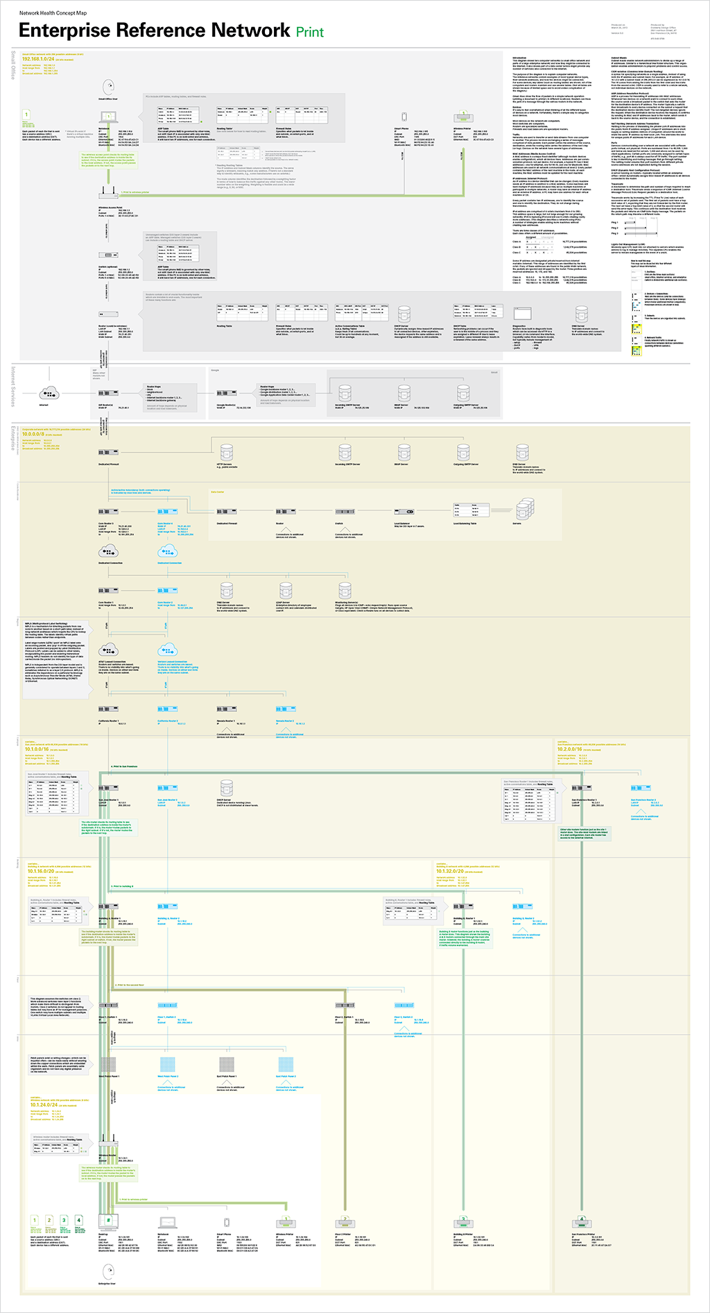
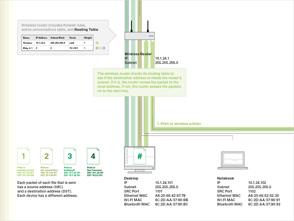
We overlaid two different types of network traffic on the reference network. Green lines show the flow of packets in a simple network operation (printing a document to printers in different locations).
Each packet of each file that is sent has a source address and a destination address. The routers check their routing tables to see if the destination address is inside the router’s subnet. If it is, the router routes the packet to the local address. If not, the router passes the packets on to the next hop.
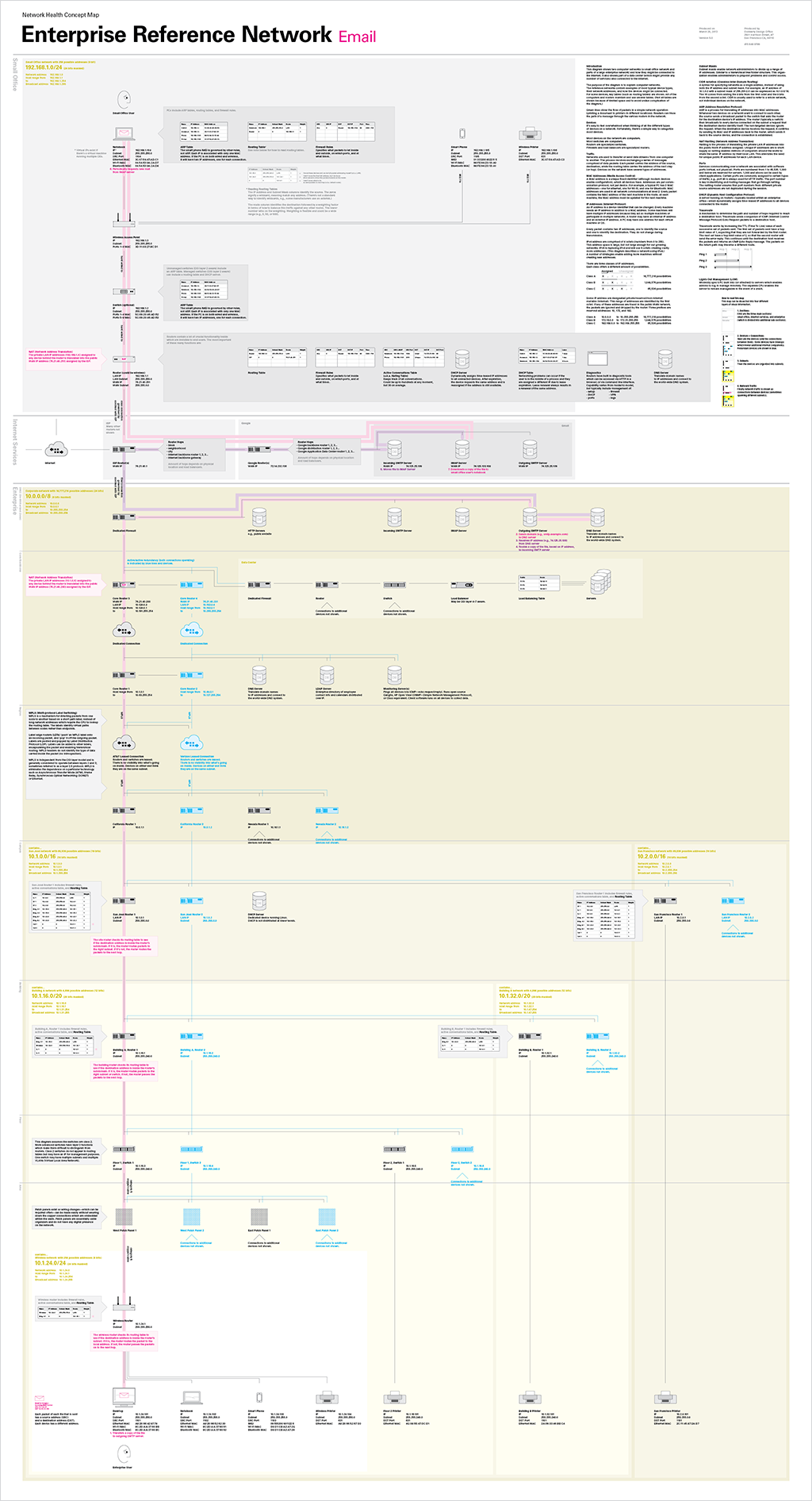
Magenta lines show the flow of traffic in a more complex operation that goes out into the internet (sending an email from the enterprise network to the small office network). Readers can trace the path of a message through various routers in the network.
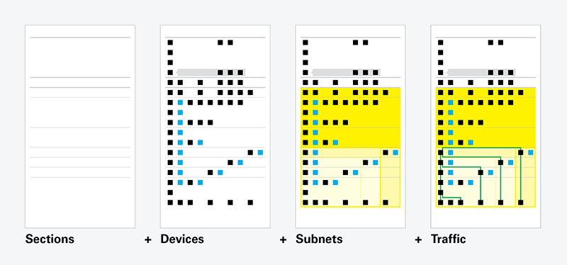
How to read the diagrams
The diagrams contain four layers of information.
1. Sections
Each diagram is organized in three main sections: small office, internet services, and enterprise (which is divided into additional sub-sections).
2. Devices + Connections
Devices (and the connections between them) are indicated with boxes. Some devices have callouts which reveal additional internal components. Redundant devices are shown in blue.
3. Subnets
Colored areas indicate subnets.
4. Network Traffic
Network traffic is shown as lines connecting devices (sometimes spanning different subnets).
Very special thanks to Paul Devine for his expertise and patience. He helped us deconstruct and reconstruct our reference networks.
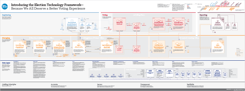
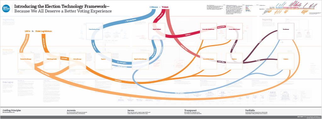
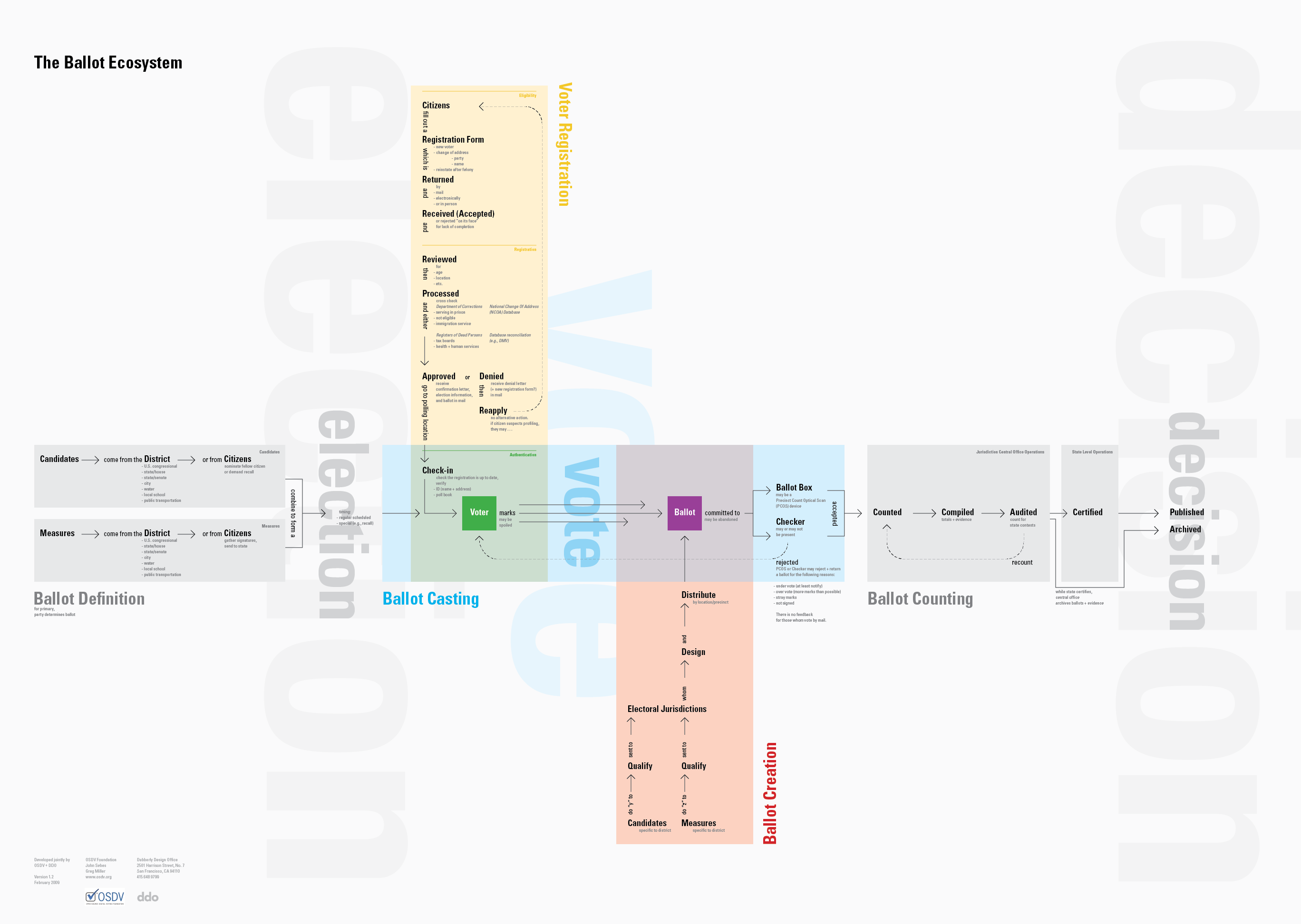
We’ve been working directly with the Open Source Election Technology Foundation (OSET) on the TrustTheVote Project — an open source project to reimagine the voting system in the United States. The TrustTheVote Election Technology Framework is something new — a blueprint for developing a complete elections system.
The framework provides a specification for open source election technology drafted by OSET and local election officials around the country.
The framework includes 14 separate components and details the data relationships between them.
Some of the components are in development. And both the Voter Services Portal and the VoteStream elections results reporting system are in alpha release.
This book provides a technical overview of the TrustTheVote Project. It begins by describing the election process and shows how that process maps to the election technology framework OSET is proposing. The book provides an overview of the framework‘s main components and then “zooms in” to provide details about each component, sub-components, links between components, and data flows that make possible the planning and execution of elections.
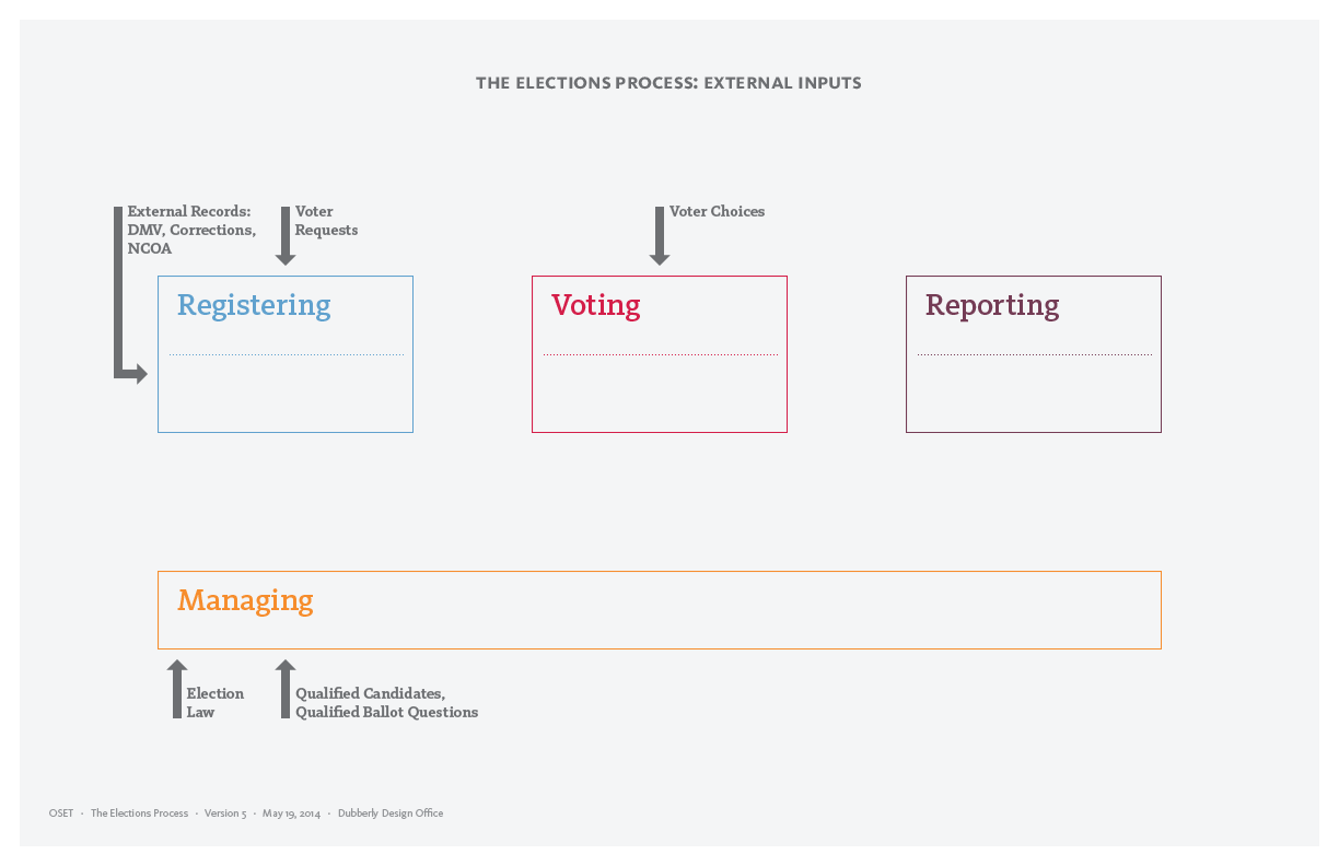
This document introduces major components of the high level model of the elections process: External inputs, internal processes, and logs. It includes a diagram of step-by-step activities that constitute an election.
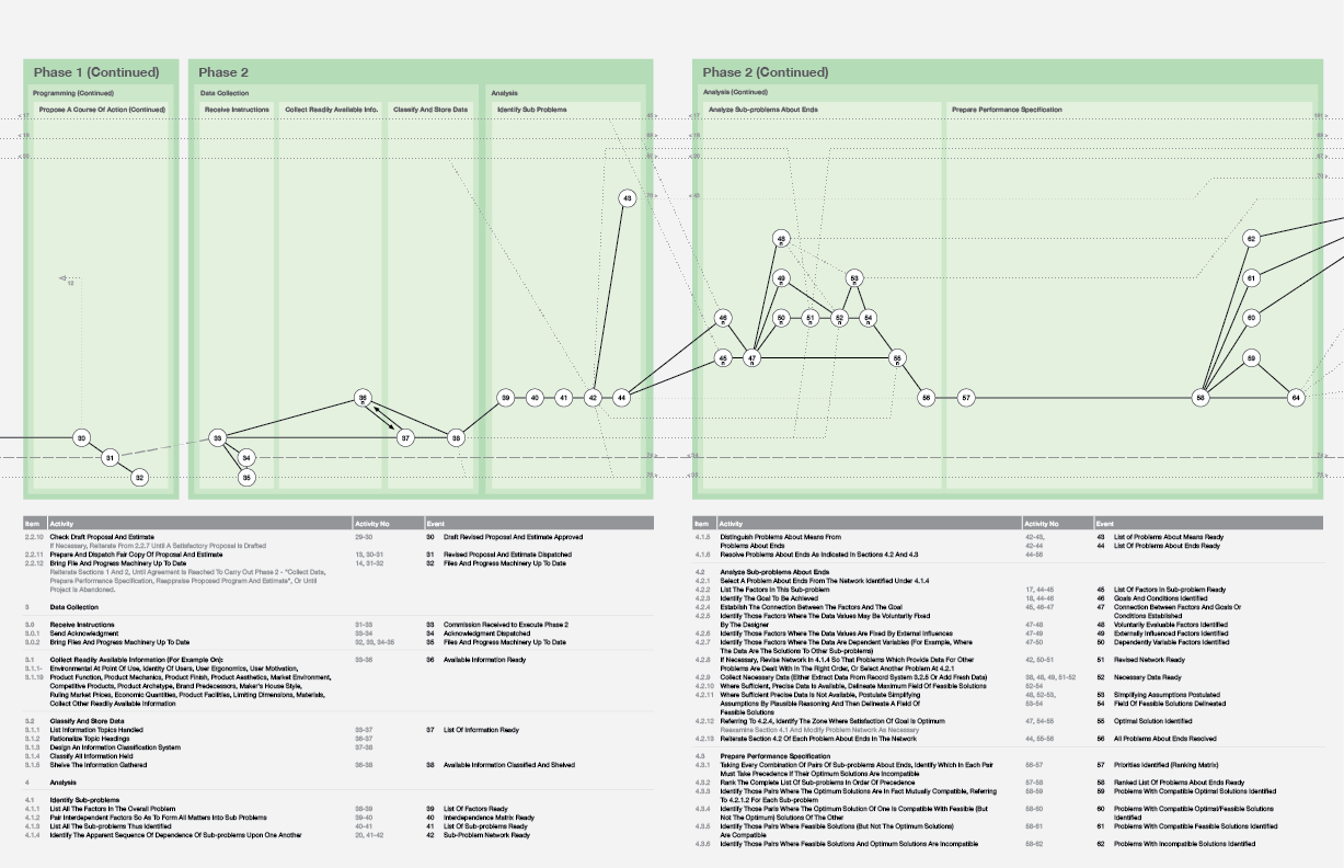
The image above is only a small slice (2 of 15 pages) of the overall model.
This is a re-drawing of Bruce Archer’s 229-step design process; which is difficult to come by. It also brings together Archer’s descriptive text with the diagram for the first time.
Download PDF
This file is optimized for printing on 8.5-by-11 inch paper.
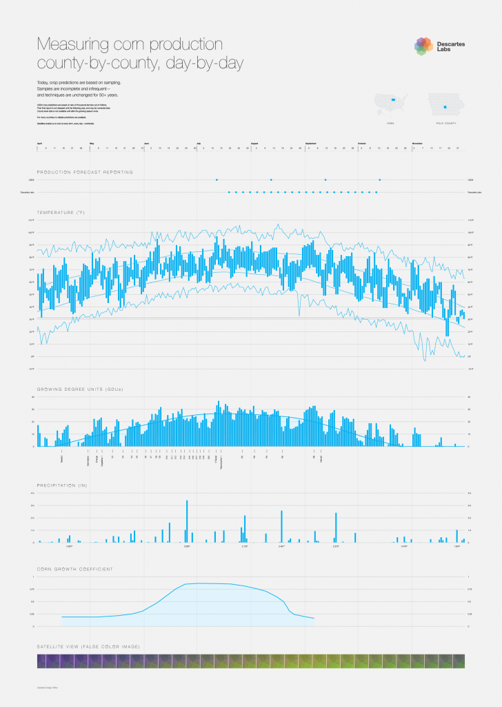
Today, crop predictions are based on sampling. Samples are incomplete and infrequent—and techniques are unchanged for 50+ years.
USDA crop predictions are based on tens of thousands farmers out of millions. Their final report is not released until the following year, and may be corrected later. County-level data is not available until after the growing season ends.
For many countries no reliable predictions are available. Satellites enable us to look at every farm, every day—worldwide.
Traditionally, much of what designers have been called upon to do revolves around giving form to artifacts—a thin veneer on top of existing products and services.
Advancements in computing and AI are now fundamentally changing design practice. These changes have significant implications for design education and continuing education. For example, it seems clear that designers will need to become familiar with programming, using data, and doing analysis to discover and visualize patterns and relationships. Like many aspects of modern society, design practice is becoming data-driven, too.
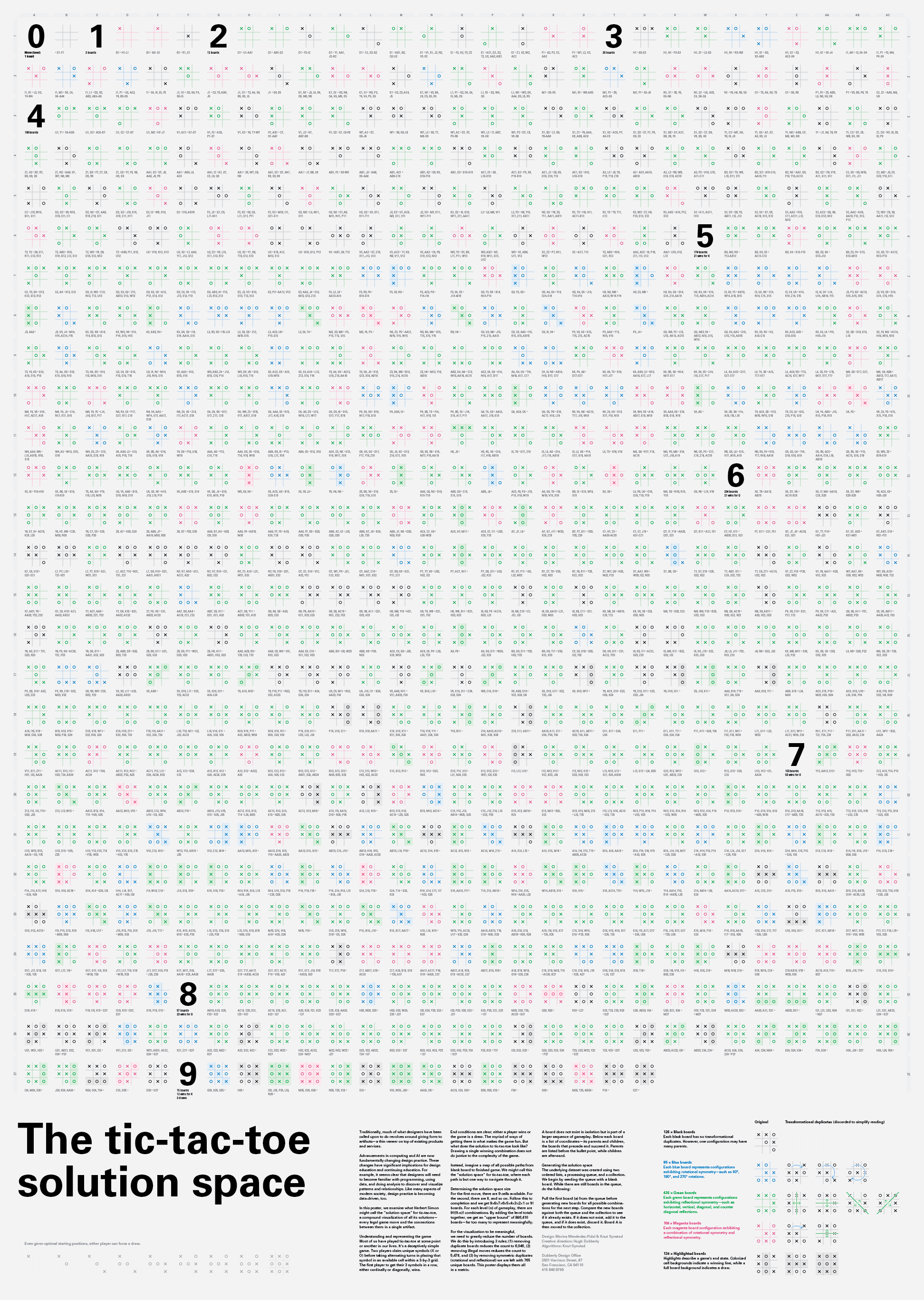
In this poster, we examine what Herbert Simon might call the “solution space” for tic-tac-toe, a compound visualization of all its solutions— every legal game move and the connections between them in a single artifact.
Understanding and representing the game Most of us have played tic-tac-toe at some point or another in our lives. It’s a deceptively simple game. Two players claim unique symbols (X or O) before taking alternating turns in placing that symbol in an available cell within a 3-by-3 grid. The first player to get their 3 symbols in a row, either cardinally or diagonally, wins.
End conditions are clear; either a player wins or the game is a draw. The myriad of ways of getting there is what makes the game fun. But what does the solution to tic-tac-toe look like? Drawing a single winning combination does not do justice to the complexity of the game.
Instead, imagine a map of all possible paths from blank board to finished game. We might call this the “solution space” for tic-tac-toe, where each path is but one way to navigate through it.
Determining the solution space size For the first move, there are 9 cells available. For the second, there are 8, and so on. Follow this to completion and we get 9×8×7×6×5×4×3×2×1 or 9! boards. For each level (n) of gameplay, there are 9!/(9-n)! combinations. By adding the level totals together, we get an “upper bound” of 986,410 boards—far too many to represent meaningfully.
For the visualization to be meaningful, we need to greatly reduce the number of boards. We do this by introducing 3 rules; (1) removing duplicate boards reduces the count to 6,046, (2) removing illegal moves reduces the count to 5,478, and (3) by removing symmetric duplicates (rotational and reflectional) we are left with 765 unique boards. This poster displays them all in a matrix.
A board does not exist in isolation but is part of a larger sequence of gameplay. Below each board is a list of coordinates—its parents and children, the boards that precede and succeed it. Parents are listed before the bullet point, while children are afterward.
Generating the solution space The underlying dataset was created using two ordered lists, a processing queue, and a collection. We begin by seeding the queue with a blank board. While there are still boards in the queue, do the following: Pull the first board (a) from the queue before generating new boards for all possible combinations for the next step. Compare the new boards against both the queue and the collection to see if it already exists. If it does not exist, add it to the queue, and if it does exist, discard it. Board A is then moved to the collection.
This poster shows variations on Venn diagrams, outlining a space of possibilities for representing overlapping sets. Cells in each row build on a theme or approach, adding one set to each subsequent cell. Cells in each column have the same number of sets (1 to 8) enabling readers to compare approaches.
Row 1 begins with the classic Venn circles, but in the 4th cell John Venn introduced a curved shape, because four overlapping circles cannot include all the possible intersections of 4 sets; that is, intersections BC and AD are missing. Adding more sets requires adding more curves, forming something like a comb. But after 5 sets, the new regions become tiny and the diagrams lose some usefulness.
Row 2 shows that a single oval shape can be overlapped to produce all the intersections for up to 5 sets. After that, adding sets becomes more difficult. In a Venn diagram with all the intersections of 6 sets, the shapes cannot be the same. More generally, only prime numbers of sets will have rotational symmetry, as in A.W.F. Edwards’ 7-set. It was a breakthrough.
Row 3 also builds on other work by Edwards.This version derives from unwrapping a sphere, placing a circle around the equator, and then running a wavy line above and below. Each next cell doubles the wavy line, a process that can be extended indefinitely, but new intersections again become vanishingly small.
Row 4 unravels the equator and its ribbons into a straight line bisected by sine waves of increasing frequency. Again, more sets create small intersections.
Row 5, in its first 4 cells, is very like row 2. Rotating cells in row 5 to the right by 45 degrees helps show how they map 1-to-1 with row 2. In the second set of 4 cells, Dodgson introduced a cheat, repeating the first 4 steps nested inside each intersection of the 4-set version.The cheat is that sets 4-to-8 are discontinuous.
Row 6 is a recent breakthrough. Sets 1-to-4 are classic Dodgson-Venn, but 5-to-8 introduce a variation on the comb, which in principle should be extendable. What’s especially useful about this approach is that most of the individual cells are the same size.
Row 7 does not depict Venn diagrams; rather it shows binary lists of the unique regions created by overlapping each group of sets. That is, N sets will have 2^N intersections. The intersections can be derived by counting in base 2, where each binary column represents a set, and the presence of a 1 in a base-2 number indicates the overlap of the set in that region. For example, 2 sets (01 and 10) have four permutations: 00, 01, 10, and 11. Their overlap is 11, and 00 is the area outside the sets.
Row 8 shows another way to think about the regions. Each region or intersection is an address — a coordinate in an N-dimensional space, which may be represented by an N-dimensional hypercube. This representation emphasizes that Venn diagrams depict a space of possibilities.
Row 9 shows what happens if each set is a circle. Sets 1 to 3 are fine, but with 4 sets and above, some intersections are missing.
Row 10 lists the missing intersections. Here, each set is labeled with a letter, so that the missing combinations can be shown with a letter code.The letter combinations can be generated from binary by substituting a letter for a 1 in each column and replacing a 0 with a dash (–). Thus 1111,1111 (the intersection of 8 sets) becomes ABCD,EFGH.
The concept of “trust” turns up in many discussions about people and organizations — and also in an increasing number of discussions about systems and technology.
The figure above pulls together some relevant ideas. It’s simply a list, not yet a proper concept map.